Year
2024–2025
Timeframe
4 weeks
My role
Product Strategy · UX · UI · Design System · Solo Builder
Industry
SaaS · Creator Tools · Marketing Tech
Scope
Brand narrative, product architecture, UX flows, UI system, dashboard design, marketing site
Tools
React, JavaScript, Figma, VS Code, Tailwind
Kompi is the all-in-one platform built for creators, entrepreneurs, and modern digital brands who need more than just a link-in-bio. It brings together link management, QR experiences, analytics, digital cards, and audience growth tools into a single, elegant system.
Kompi was designed for the growing class of individuals and small teams who want a professional online identity without needing complex tools, agencies, or technical skills.
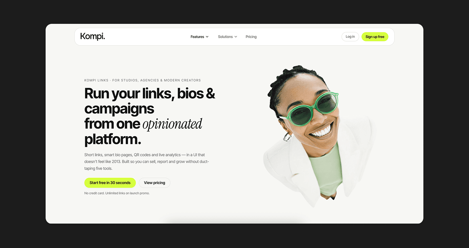
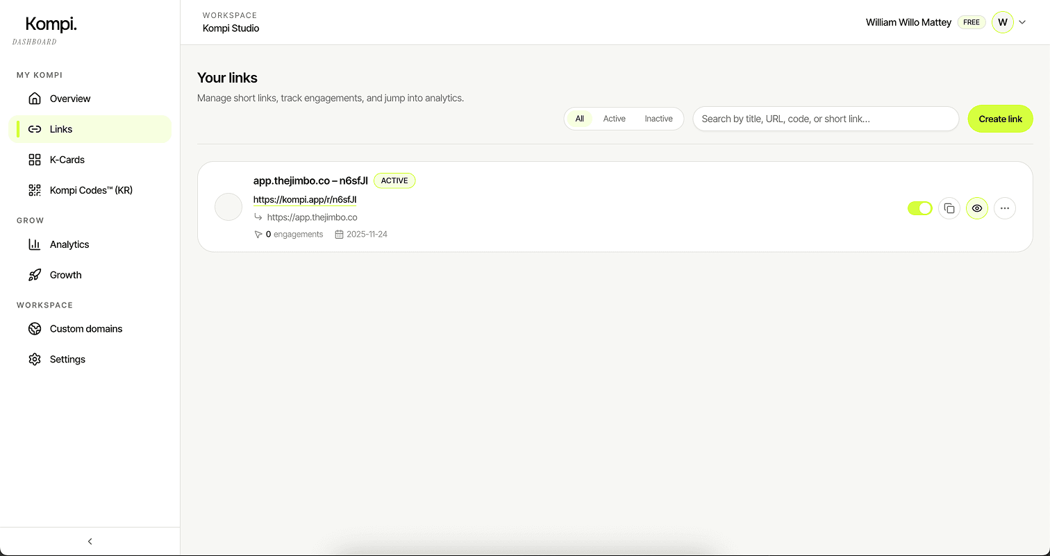
Kompi — core dashboard experience
What Kompi Is
At its core, Kompi is a unified identity and engagement platform. It lets users create a personalized digital page, generate branded QR codes, manage smart links, track analytics, collect subscriber data, and share their presence everywhere.
Instead of juggling multiple tools, Kompi becomes the single hub that houses a user’s digital footprint and helps them convert attention into action. It is seamless, visual, and deeply customizable, offering a level of polish that feels premium and modern.

Identity, QR, links, and analytics connected through a single surface
The Vision Behind the Product
The vision for Kompi started with the belief that the online identity tools available today were fragmented, generic, and often lacking emotional impact. Most platforms offered functional tools but no sense of brand ownership, individuality, or craft.
Kompi aims to bridge that gap. It aspires to become the digital front door for creators — a place where personality meets performance. The long-term vision is to create a creator infrastructure stack that empowers users to own their audiences, their brand, and their data, while delivering experiences that feel beautifully designed, personal, and distinctly theirs.
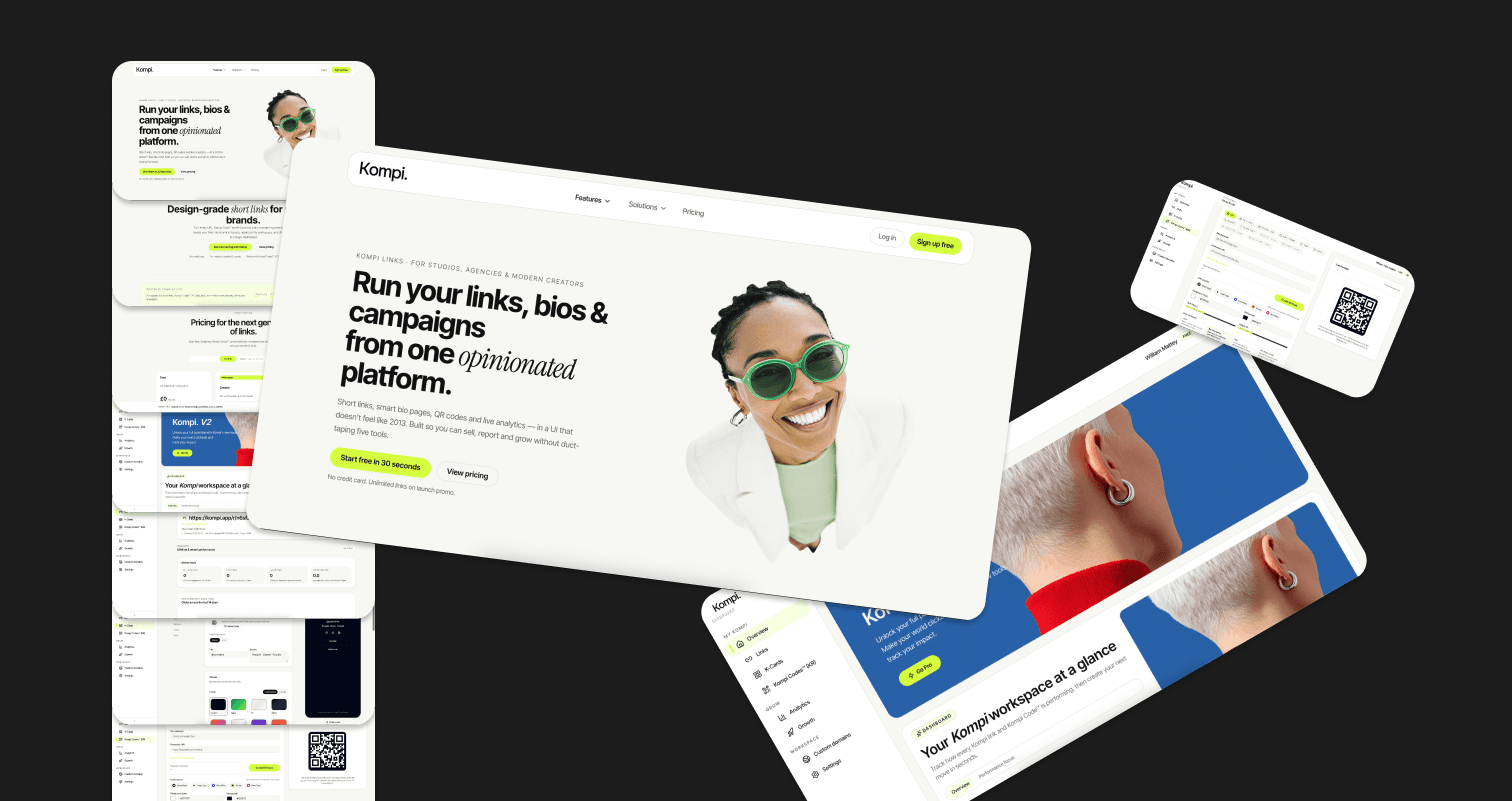
Exploring Kompi’s positioning as a creator infrastructure layer
Defining the Challenge
The biggest challenge was figuring out how to unify multiple capabilities — link management, QR code generation, K-Cards, analytics, monetization flows, and branding tools — into a single intuitive experience. Each of these capabilities traditionally exists as a standalone product.
Bringing them together in a way that felt coherent required rewriting the information hierarchy and creating onboarding paths that were simple enough for beginners yet deep enough for experts. Another challenge was maintaining a sense of fun and creativity while handling serious functions like data, subscribers, and workspace management.
Early explorations around flows, hierarchy, and surfaces
Research & Insight
Conversations with creators, small business owners, and independent makers made it clear that users wanted both speed and expression. They valued aesthetics but did not want to be designers. They cared about analytics but did not want charts that made them feel like analysts.
They needed tools that reflected their personality without overwhelming them. A recurring insight was that people were tired of platforms that looked and felt identical; they wanted ownership of their brand, not just a profile on someone else’s template. This understanding pushed Kompi toward a design-first, creator-centric approach.

Synthesising qualitative insights into a creator-first direction
The Product Architecture
Kompi’s architecture centers around the workspace — the single place where users manage everything: links, QR codes, analytics, subscribers, and their K-Card. Each component operates as an independent module, but all are woven together through a unified design system, shared preview logic, and a consistent mental model.
This modular structure makes it easy to extend the platform with future features while ensuring the experience remains seamless and predictable. The system is built to feel lightweight on the surface, even though the underlying capabilities are robust.

A modular architecture connecting workspaces, links, QR, and analytics
Creating the Brand
The Kompi brand needed to feel modern, expressive, and human. It intentionally blends softness with boldness — fluid gradients mixed with confident type, vibrant colors paired with dark, atmospheric UI surfaces.
The brand tone balances warmth and sophistication, signaling that Kompi is both approachable and premium. Everything from micro-interactions to typography choices reinforces the idea of a digital sidekick that supports you without overshadowing you.
Brand world and product surfaces sharing the same language
Name & Brand
The name Kompi is a condensed form of the Spanish word compañero, meaning companion or sidekick. It carries the spirit of something reliable, helpful, and always by your side — exactly the feeling the product aims to evoke.
Beyond its meaning, the name works well for a tech brand: it is short, catchy, easy to pronounce, and visually compact. Kompi feels memorable and friendly while still being modern and functional. The brand leans into this identity by positioning itself as the quiet partner that empowers creators to shine.
Logo mark and wordmark directions around the idea of a digital companion
Look & Feel
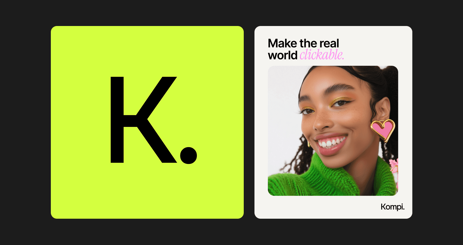
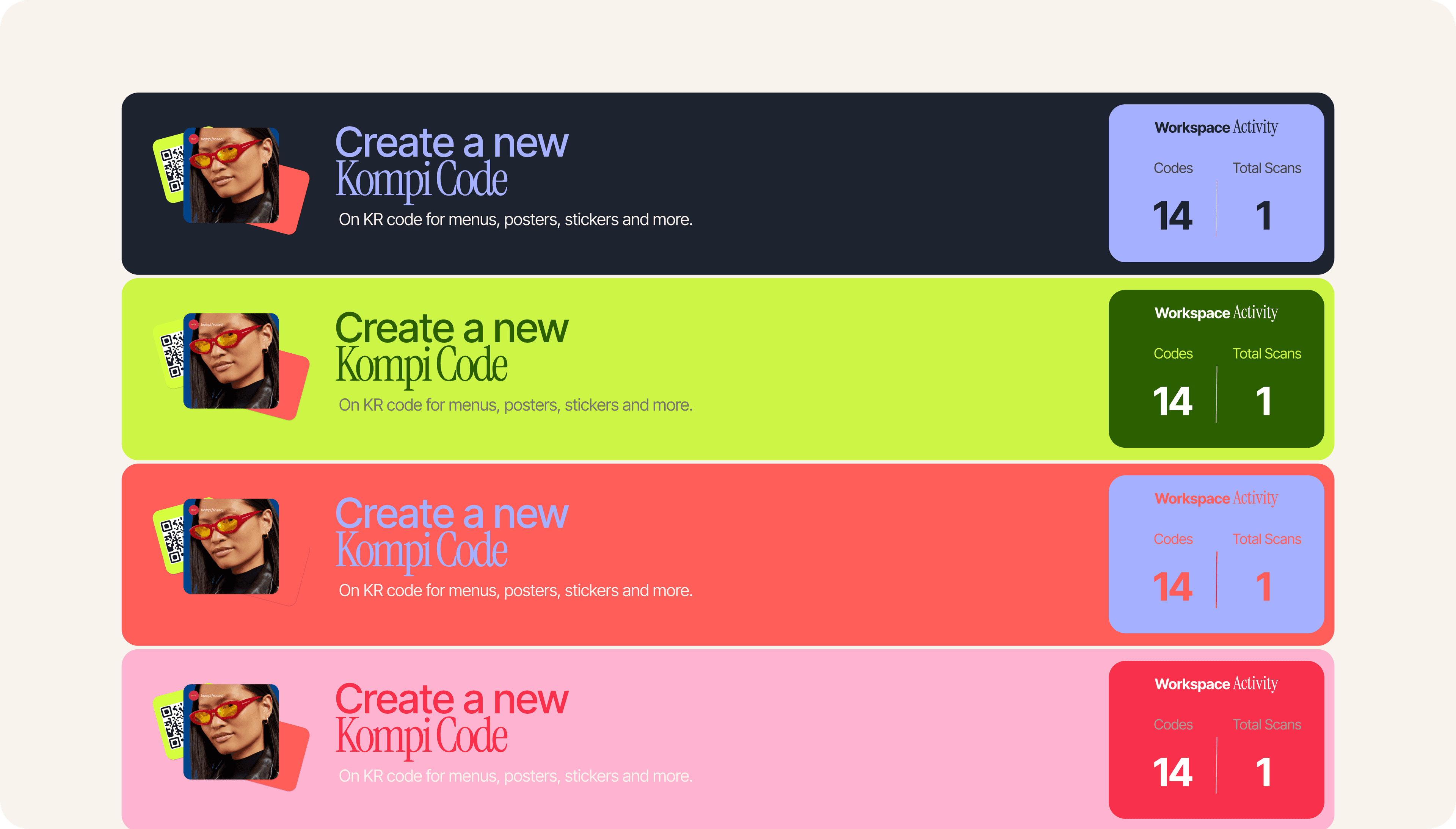
Kompi’s look and feel is defined by bold contrasts, neon accents, and a sense of digital energy. The signature lime-green color — #d4ff3d — acts as the primary accent across the platform.
It is vibrant, assertive, and instantly recognizable, creating a strong brand moment in both dark and light environments. Paired with deep navy surfaces, soft gradients, and subtle lighting, Kompi’s visual system feels alive without becoming overwhelming. The interface blends precision with playfulness, giving users the feeling that they are interacting with something crafted, not commoditized.
Color, gradients, and composition exploring Kompi’s visual energy
Design
The design language blends crisp geometric components with expressive motion and generous spacing. Typography plays a pivotal role: Inter Tight is used as the primary UI typeface for its clarity, tight geometry, and modern edge, while Instrument Serif adds warmth and editorial sophistication in hero sections, marketing visuals, and product narratives.
Together, they create a visual voice that is both contemporary and characterful. Rounded corners, soft shadows, and gradient overlays give the product a sense of depth, making the digital space feel tactile and polished.
Type, motion, and component language defining Kompi’s design voice
Design Assets
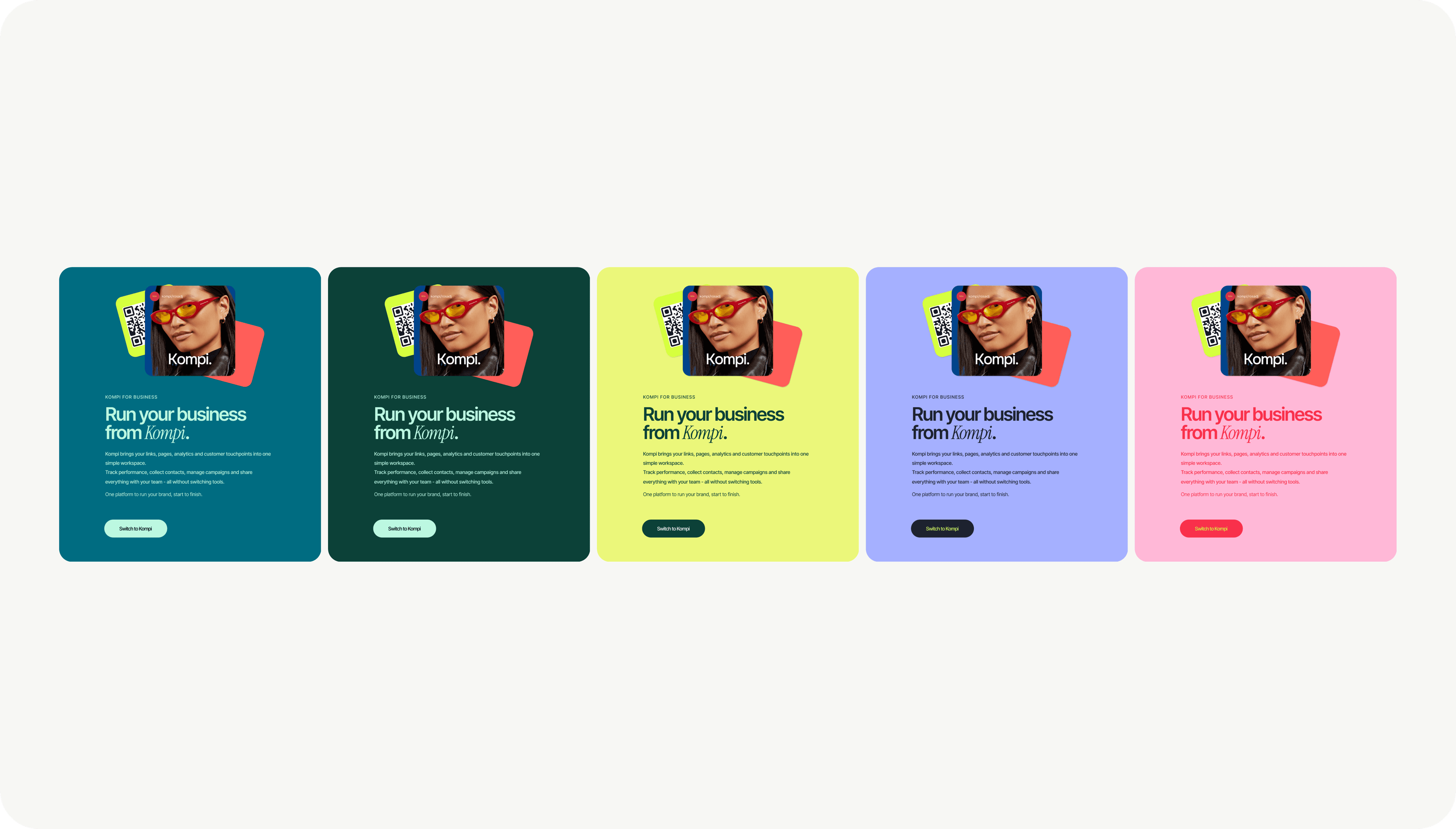
A rich set of design assets supports the Kompi brand: gradient wallpapers, logo marks, abstract shapes, branded QR frames, animated illustrations, and high-contrast component variants. These assets are designed to be reused across dashboards, public pages, and marketing surfaces so the brand feels cohesive everywhere.
The signature lime appears as a recurring highlight, instantly tying everything back to the Kompi identity. The asset library also includes templates for K-Card themes, share previews, social cards, and onboarding visuals, creating a unified aesthetic across touchpoints.
Asset library spanning wallpapers, QR frames, and shareable surfaces
Designing the UI System
The UI system is a carefully structured set of components that balances visual expression with professional clarity. Spacing scales, grid systems, color tokens, shadows, and typography rules were established early and expanded as the product grew.
This system allowed Kompi to evolve rapidly while maintaining consistency. Buttons, cards, inputs, dashboards, tables, modals, and previews all follow the same design logic, making the interface feel intuitive even as features become more complex. The unified system also makes customization easier for users, allowing their personal style to shine on top of a stable visual foundation.

Components, states, and patterns from the Kompi UI system
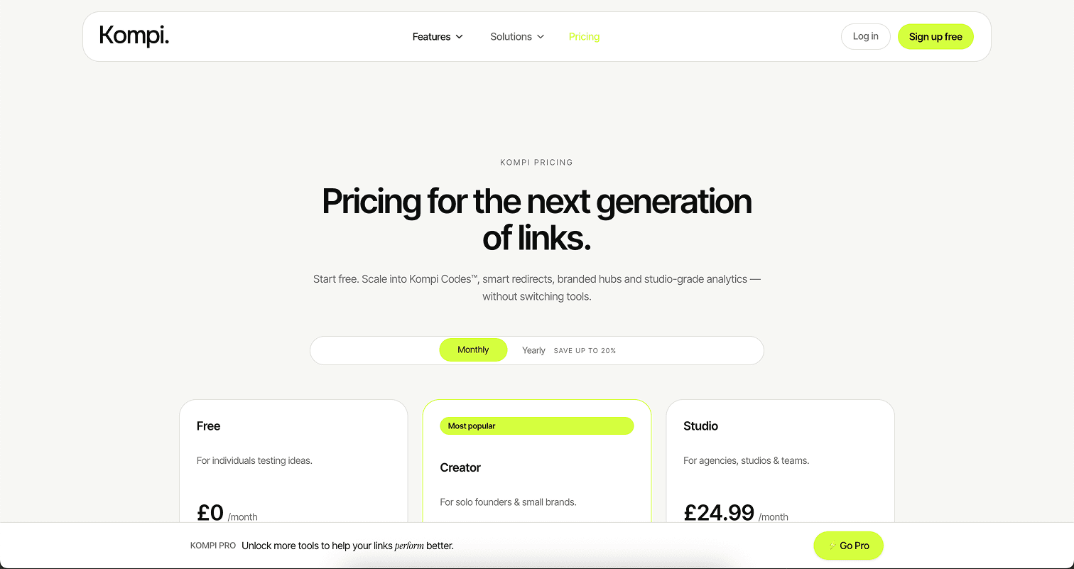
Key User Flows
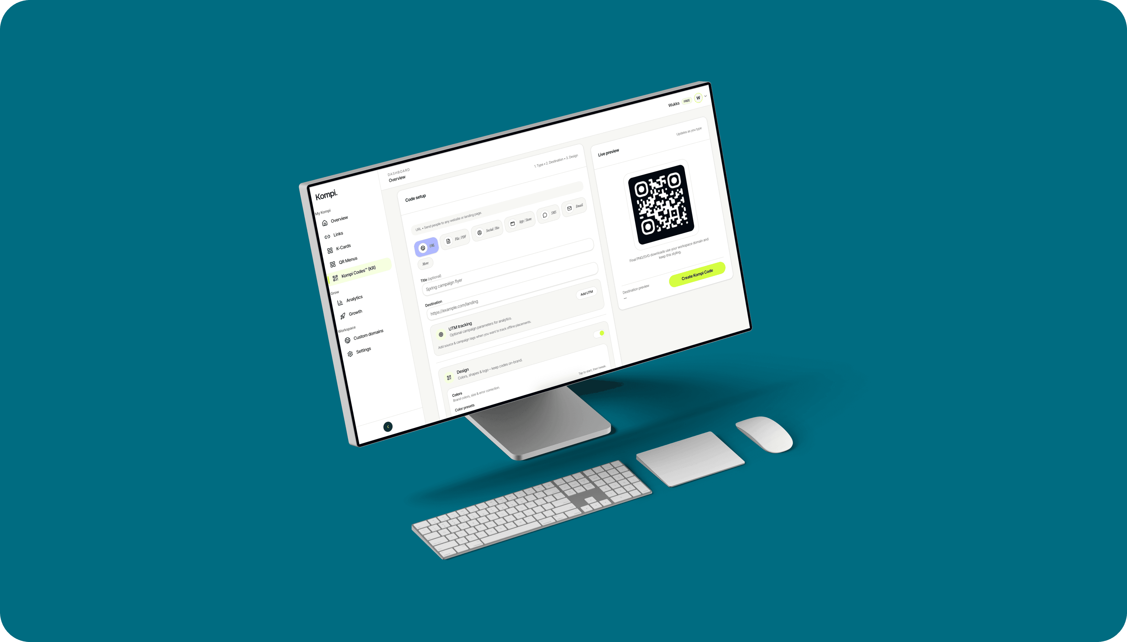
Key flows emphasize spontaneity and immediacy. Creating a K-Card feels like sketching on a digital canvas — users see live previews with every change. Adding a link requires no configuration beyond its title and URL.
QR codes update in real time as users customize colors and frames. Analytics load quickly, focusing on actionable insights rather than dense data. Kompi’s flows aim to feel satisfying and expressive, giving users rapid feedback and a sense of progress at every step.
Creation flows designed to feel fast, expressive, and low-friction
The Dashboard
The dashboard acts as the heart of the platform, presenting users with their core tools and insights. It offers a mix of creative and analytical elements: link performance, audience growth, page visits, QR scans, and shortcuts to create new assets.
The layout remains calm and spacious even when it displays data-heavy content. It is designed to make the user feel in control, giving them a clear understanding of their digital ecosystem while keeping the interface approachable.

A calm control center for links, QR, pages, and analytics
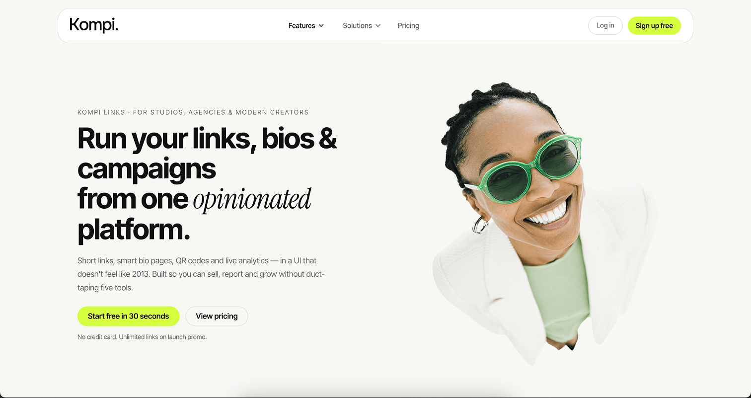
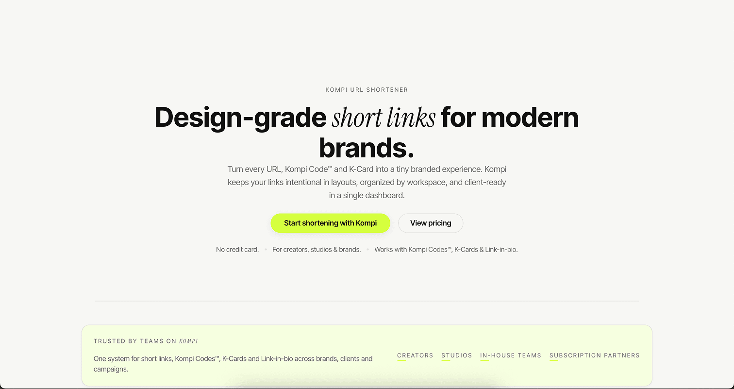
The Website
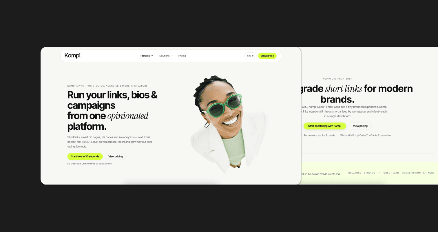
The website introduces Kompi through a narrative that blends storytelling with interactive product showcases. Hero sections use bold typography and vibrant color accents, supported by Instrument Serif to create emotional resonance.
Product visuals are rendered as clean, high-contrast UI frames that echo the dashboard’s look and feel. The goal is to inspire visitors by showing Kompi not just as a tool, but as a creative companion that elevates a user’s digital identity.
Marketing site and product frames presenting Kompi as a creative companion
Reflection
Kompi emerged from a desire to merge creativity, clarity, and capability into a single platform. It demonstrates that digital identity tools can be expressive without losing professionalism, and powerful without being intimidating.
The process of shaping Kompi reinforced the belief that creators value authenticity, beauty, and control. As the platform evolves, its commitment remains to empower users to own their brand, grow their presence, and build experiences that feel personal and unmistakably theirs.
Kompi as a foundation for a broader creator ecosystem